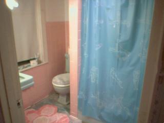
This is your worst nightmare! I remember when Mike and I took our first tour of the house with our realtor and caught our first glimspe of the bathroom that wins the superlative in both Ugliness and Small-ness. As you can see, it combines the aweful gross yucky bright green with the equally aweful gross yucky bright pink to form.... duh duh duhhhhhhhh! A grucky preenk design disaster.
And, if that wasn't bad enough, this bad-adz bano sizes out at a whoppingly enormatron 6 by 7 feet. Now if you're sitting in front of your computer thinking that 6X7 is not so small, and that Mike and I could just put in a stand up shower and could have plenty of room for a nice vanity and some storage and a toilet that's not green - then you don't realize that this is our one and only bathroom and I want - scratch that, NEED a jacuzzi tub.
Now you're probably sitting in front of your computer thinking, "There Jess goes again, being rediculous and wanting something that is beyond the limits of her architecture." And believe it or not, up until about a week ago, I was thinking the same thing. The jacuzzi tub, toilet, and vanity would not, could not all fit in the bathroom. I had done several to-size layouts with tub, toilet, and vanity cutouts moving around on sheet of graph paper when we first moved into the house, but none worked. Of course I became ever-so frustrated and threw them all away, declaring that we'd have to tear the bathroom off the house and build a bigger one.
Then, just under a week ago I caught the premier of Small Spaces, Big Style on HGTV. These people lived in the tiniest homes and yet they managed to incorporate all their needs and style through creative thinking. I realized as the show ended that I had been looking at this little bathroom problem in the wrong way! Having a tiny bathroom wasn't, in fact, a problem. It was an opportunity to really be creative and stretch my desginer's wings.
Immediately I got out the graph paper again. I knew I had to give up the idea of having a corner jacuzzi, it was just too large. I looked online and found a tub I liked. (I knew I wanted one from the jacuzzi espree series, available at Lowes - check out a picture of the one I picked. Skirt included. Isn't it pretty?) This tub is 3 feet wide and 5 feet long. Our current tub (behind that lovely shower curtain in the picture) is only 4 feet long and 2 and a half feet wide. Can you imagine? It's very small. So this means the jacuzzi would not fit in that spot.
I decided to place the tub along the current toilet/window wall. The wall is 6ft long, so the 5ft tub pushed onto the back wall will leave a 1ft space (where that green sink is now) in which to put a small water/linen closet - depending on the room we have. (You know you always have to leave a little room for fudging around with when it comes to bathtubs.) This also means that the window will have to go - which is ok because it's an old lead paint window that needs to go anyway. We will replace it with a smaller or thinner rectangular window with frosted glass, which we will place higher on the wall.
The tub area will also incorporate a lover's shower - that's two shower heads, one on either side wall, each with their own controls. This has been a dream of mine and Mike's forever.
Where the original tub was, we will put the toilet area. (Right on the back right wall - toilet facing towards the tub.) I measured the current toilet nook, a 2 and a half by 3ft rectangle, and allotted the same space in the new location. (We'll be purchasing a new, super flush American Standard toilet and throwing away our plunger soon after.)
Now this was always the point where I got stuck when I was originally trying to design this bathroom. Sure, the tub and the toilet can squish in there, but where can I put the vanity and sink? Well, thinking about Small Spaces, Big Style, I decided to probe the internet for a compact wall sink or vanity.
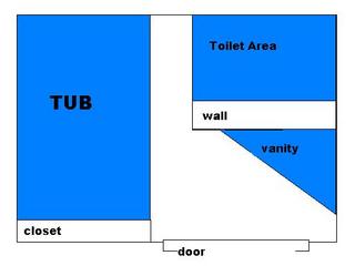
The answer came from Lowes, who has a small, 2x2 corner vanity and medicine cabinet/mirror. So, imagine that you're sitting on the new toilet, facing the jacuzzi tub in the back right corner of the bano.... that may be kinda weird for you to think about, but bear with me. On your left, Mike and I will build a wall - thus enclosing the toilet area in a nook. Can you picture it? No? Well, here's a little (non-to-scale) plan for you.
 Ok, so as you can see from the diagram, the corner vanity fits neatly into this little nook. Isn't that ingenious? Now, the design incorporates towel racks in a couple places: between the tub and toilet area and next to the two edges of the vanity. There will also be two hooks on the toilet area wall to hang my robe or a towel, etc.
Some of you may say, hey wait! How do you open the door? Well, I decided to replace the door with a bi-fold door for that very reason. Others may say, isn't that a teenie space beween the toilet area and the tub? The answer is, yes, but you'll still be able to squeeze by and it's a small sacrifice to be able to have the tub.
In addition to that one window over the tub, Mike and I will also put in a frosted glass skylight along with recessed lighting, sconces on either side of the medicine cabinet, and a red light special fan/heat lamp like they have in hotels.
The small space also will allow us to incorporate otherwise expensive features, like a river rock floor and gorgious mosaic wall tiles.
And plus, now we don't have to wrip the bathroom off the house to build a bigger one.


4 comments:
Wait wait wait ... what's green? The fixtures? That's soooo cool. I'm thinking of going a pale pistachio green on the walls of our "mauve" bathroom. We also have a pink bathroom, with all grey fixtures. Check it out here: http://revivalized.blogspot.com/2005/08/diy-or-not.html
I can certainly understand wanting to reorganize the layout to maximize space, but in the meantime, I think it does help to embrace what you have. I've done a fair amount of research, and the best tack is to do something else in the bathroom that is so bold and so eye-catching (black walls, big floral print) that is balances and distracts from the pink.
You want any of my green stuff? I have a teal sink, toilet, and bathtub - that goes out to anyone out there. Take it away!!!
I'm sure some would say my bathroom is hip and modern, but it's just not particularly my brand of hip and modern I guess I'd say.
Your bathroom's color scheme appeals a little more to me - that I could see doing something bold with. Funny that both bathrooms are from the same era - the 50's!
Instead of a bifold, couldn't you just swing the door out?
You know, Mike said the same thing about the door. However, if we swung it out, it would block a corner of the living room where I'd like to put a nice console table. It's just a weird location for a bathroom and a door is what it comes down to. Unfortunately, I can't change the architecture.
And I don't like to leave the bathroom door closed because then I never know if someone's inside and I get paranoid about being walked in on too.
What would be my ultimate door is a pocket door, but again, that will not fit in my wall... so bifold it will be.
Post a Comment